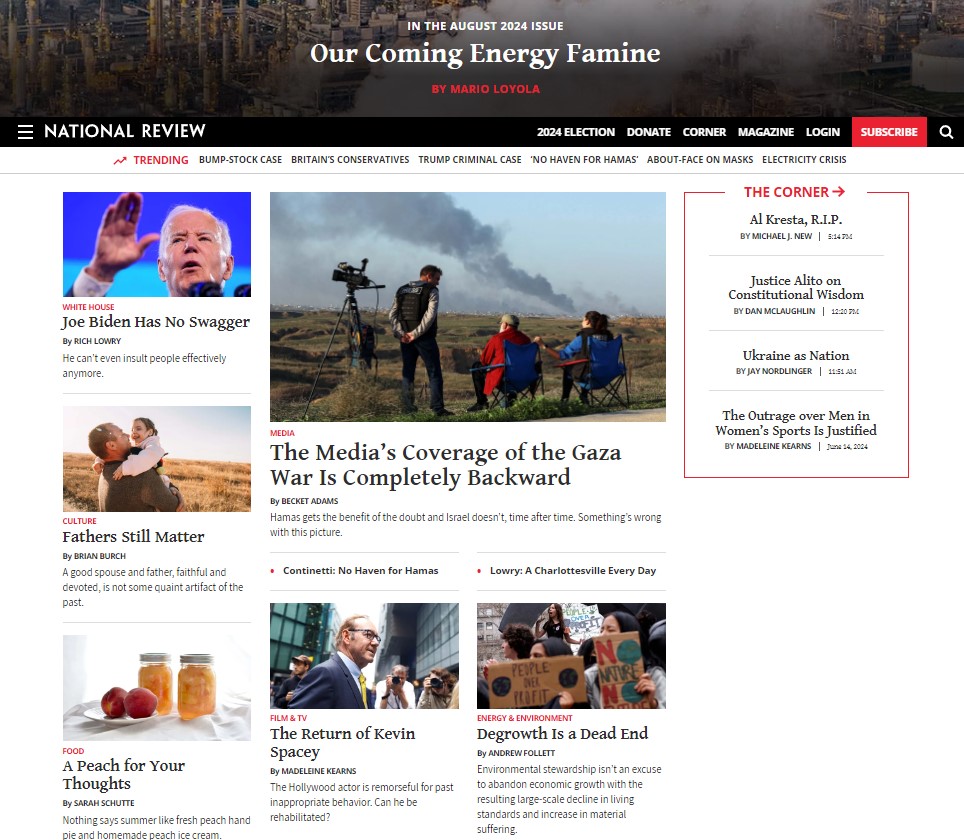
For my article Conservative INC Now Friends With Fetterman, I had to delve into the devilish neo – conservative platforms and realize that things are even worse than I thought.
These news sites look completely terrible. I am running a two – man team with this as a hobby for all contributors. Yet my site is on par, if not better looking than these major players. Consider I was running a million dollar business based on the news; I would probably have already created a site that washes your balls while telepathically sending the news to your frontal lobe.
The phrase ‘less is more’ is just so apparent. Porn sites have less spam than these platforms. It’s truly outrageous that a homepage contains a hundred articles separated into dozens of mismatching categories. Then social media, account information, headings and even more scraps are plastered over the top in a disastrous fashion.
The other issue is that no care has been given to the aesthetics. Where are the colors, imagery, font choice and iconography? These sites claim to be different from the mainstream, yet use the exact same template. Without the heading at the top, I could not differentiate any of these sites from one another. It’s really a tragedy that they have the money to improve their visuals, but choose not to.
The more I think about this, the more I realize that the lack of visual appeal is probably intentional. There is not one cool person on Earth that reads The Daily Wire, Breitbart or National Review. It’s not made for the dandy reactionary, but rather for the slow boomer. They are attempting to imitate the mainstream because that’s what the pensioners are used to. Therefore any changes to improve aesthetics may scare away the targeted audience.
I found Turning Point USA and Blaze Media are a slight improvement because they have a style targeting a younger audience. This proves that the other neo-con sites can change, but are instead purposefully making their aesthetics bland for the older consumer. However even the slightly better sites still have terrible pop up adverts and a sea of pointless information on every page.
This artistic tragedy is all new to me because I’ve barely visited any neo – conservative websites. Their policies are so predictable with the repeated proposal of conserving what existed merely a decade ago. I truly believe in the physiognomy of websites and that is why such ugly ideas are worthy of even uglier aesthetics.


